In March last year I participated with a team of AI students in the first datathon (hackathon focussed on machine learning) in the Netherlands. The challenge during this hackathon was making the most out of data to improve sustainable fishing. In only 24 hours we went from no idea at all to a working prototype.
Currently the world catches more fish than are “regenerated”. Not only does this harm the environment, by doing this less fish are regenerated each year causing a smaller total yield. This makes sustainable fishing a difficult to solve social problem.
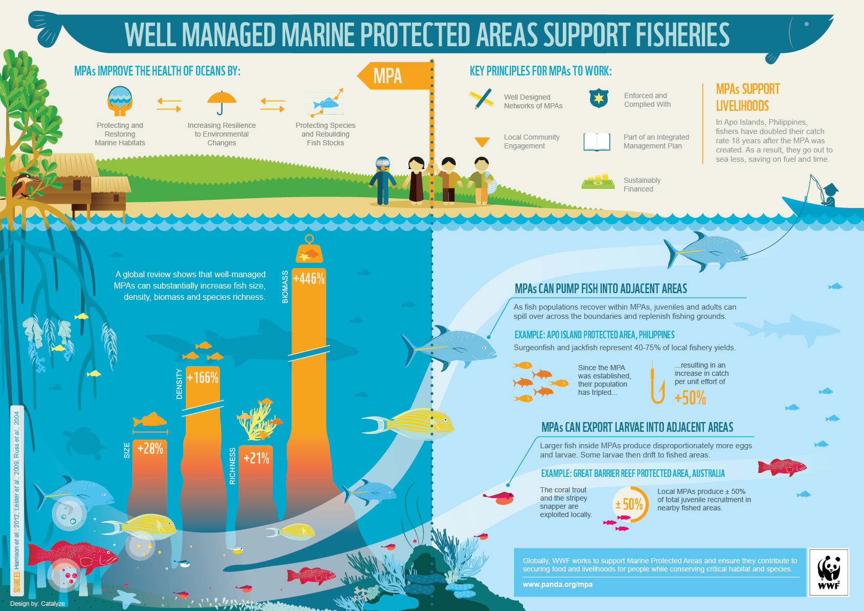
Part of the datathon was coming up with an idea, and finding data with this idea. We decided to look at possible solutions against overfishing and found out that the best way to tackle this problem was setting up Marine Protected Areas. In the Philippines several experiments have been conducted with these zones, and the world wildlife fund published an infographic with results. Note that a well-managed Marine Protected Area increased the biomass in that area with 446 percent.
 source:
http://wwf.panda.org/_core/general.cfc?method=getOriginalImage&uImgID=%26%2AR%24%27%21%2EK%3F%0A
http://wwf.panda.org/what_we_do/how_we_work/our_global_goals/oceans/solutions/protection/protected_areas/
Unfortunately, randomly selecting Marine Protected Areas is not very efficient. There are a number of factors that determine if a location is suitable. A mangrove forest or a coral reef (both good places for food and breeding) are positive influences, while places near cities are bad, as the water is more polluted.
We tried to find how people currently select Maritime Protected Areas, and found one paper in which researchers manually scored several places near a small part of the coast of the Philippines. We decided that this was something that this was a problem that if we handled it correctly could:
- Improve how Maritime Protected Areas are chosen
- Be automated: if given data, would map the whole world (contrary to the methods applied to small areas right now)
- Be configurable: different areas are influenced by other factors, make it easy for researchers to tweak what factors are important for each region or species.
- Scalable: if we found more (worldwide) data, we could immediately add it to our algorithm
The reason we were excited about solving this problem was that automatically selecting areas would greatly help with setting up the areas. Right now the setting up is also a social problem: it is difficult to convince the population that there should be an MPA somewhere, as this means a short-term restriction for the population. As a classic “tragedy of the commons” problem, nobody wants to have a Marine Protected Area in front of their coast, although everybody would benefit from it. Letting software determine automatically what good places are aids the negotiation with local policy makes.
Results
After 24 hours of coding and analysing data we mapped for the whole world how suitable each place was for a Maritime Protected Area, based on the datasets mentioned in the paper “Designing a marine protected areas network in a data-limited situation”. Where previous researchers spent a long time to determine what suitable places would be, we could now do the same worldwide in a matter of seconds.
To show what we were capable of, and to tweak our results, we created a GUI. In this GUI you could adjust how important a certain factor is, automatically adjusting the mapped areas worldwide. A video of us using the GUI can be found here:
It turned out that this was good enough to bring back the first price!
Watch the aftermovie here:
Lessons learned
Searching your own (additional) data is important. We were given a USB stick with loads of datasets that might be relevant for us. While we were in the idea-design phase this data was very useful, but in our final product we did not use any of the data provided by the organisers.
Working together is important. Every two hours we took 10-15 minutes to discuss our ideas, and how we could put different data together. We were also very pragmatic during the whole datathon. At one moment different people used different data sources to come up with different metrics. At first combining this was difficult, until one of us simply decided to convert everything to pixels on a world map. A simple solution that would never be acceptable for a project longer than 24 hours, but perfect for us in the short run.
Visualisations are everything! Although our results were interesting, it started coming together as soon as we started to plot the data. Only in the last hour we started on the GUI shown in the video. However, the fact that we had something that could be tweaked live on stage is something that helped us win the first price.
Facebook Comments (
G+ Comments (add)